
The Marktplaats logo contains two elements: the symbol (including the tilted ‘Z’ shape) and the logotype (word mark) attached to this symbol (i.e. the word ‘Marktplaats’). The logotype is positioned behind the symbol. The logo generally only appears in landscape format.
Clear creator/originator
The creator or originator of our communications is always unambiguously Marktplaats. There are never any additions to the logo – we do not use ‘Marktplaats Zakelijk’ as part of the logo. For copy, we do use ‘Marktplaats Automotive’, ‘Marktplaats Admarkt’ or ‘Marktplaats Media’.
Separate use of the symbol
In exceptional cases, it is permitted to use the symbol separately. Example: when there is a lack of space, as is the case with Instagram thumbnails and the app.
You may also want to draw attention to the source at the start of an online video or TV advert. As before, you can use the separate symbol in these cases, provided the full logo is displayed at the end.
The symbol can be shown in an animation, to make it stand out more. The animation is a vertical rotation, reminiscent of a coin spinning around on a table.

Logo against background
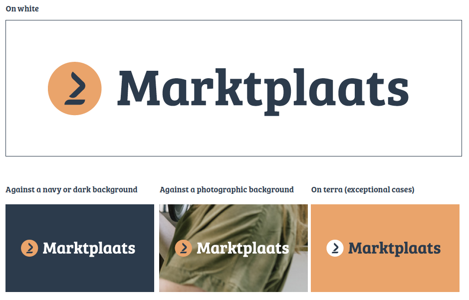
You should preferably set the logo against a white background. If you do decide to use a navy or other dark background for the logo, be sure to use the reverse logo. This reverse logo has a white prototype.
If you place the logo against a photographic background, you must ensure that the background is sparse (uncluttered) enough for the logo to remain readable.
If the logo – in very exceptional cases – is placed against a terra background, the symbol is displayed in white. The symbol always appears in the primary colours.

Logo blank space
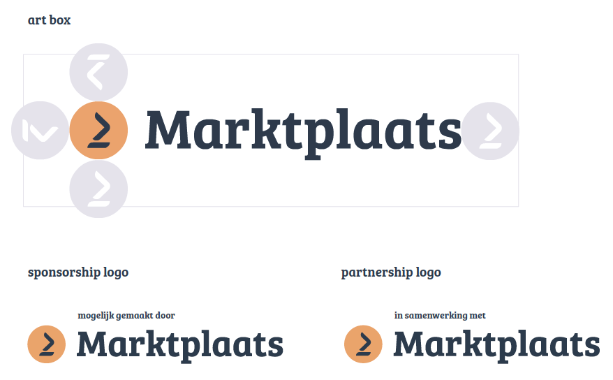
In order to make the logo stand out, it is important that other design elements are spaced out enough in relation to the logo. We have therefore created a minimum amount of blank space around the logo.
The visual on the right shows how this blank space is determined. The art box created this way is also used to position the logo. If the logo is positioned in a corner of the advert (see 02.01, ‘Logo positioning’), this must always be on the edge of the art box. All digital files of the logo include this art box. It is displayed automatically when positioning the logo.
Exception
The sponsorship/partnership logo is the sole exception to the ‘blank-space’ rule. For this logo, the Mogelijk gemaakt door (‘Brought to you by…’) / In samenwerking met (‘In asso-ciation with…’) line is positioned above the logotype. These logos
are available in a digital format. If the website of the actual event already contains copy, e.g. In samenwerking met (‘In association with…’) or Onze sponsoren zijn… (‘We are proud to be sponsored by…’), no addition to the logo is required. In this case, we use the regular, standard logo.
Logo placement
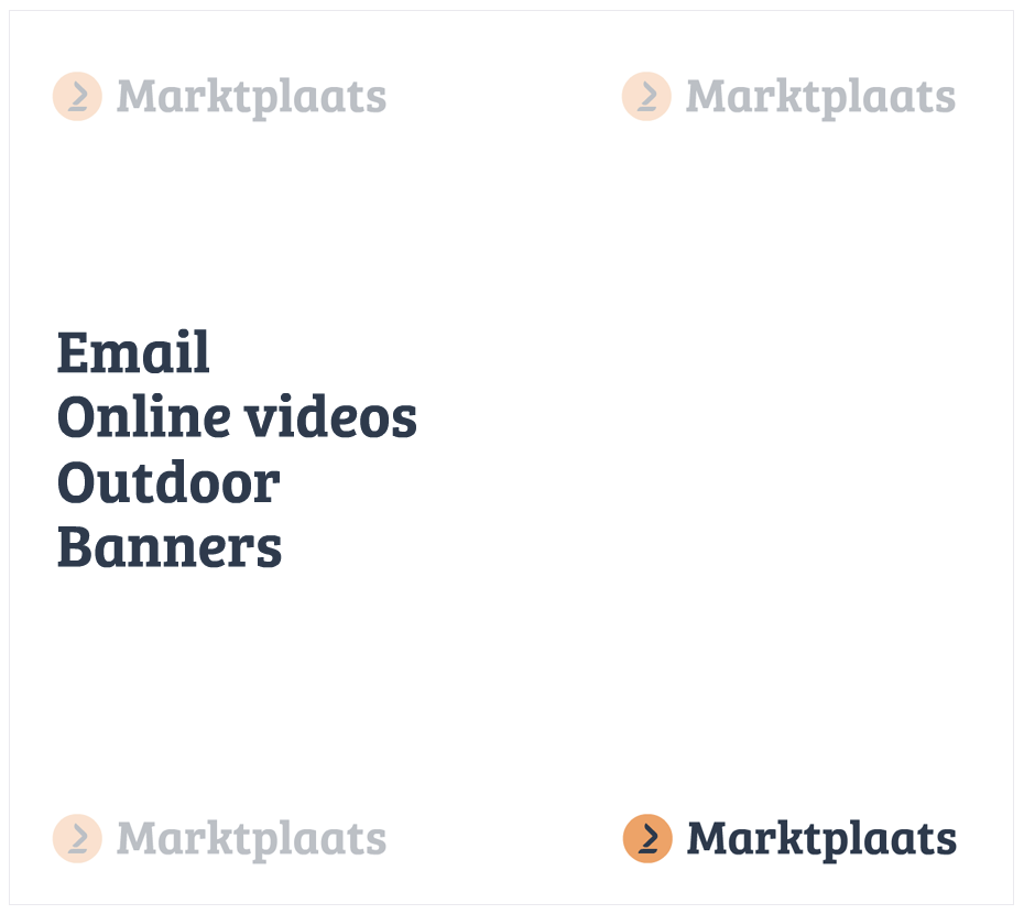
The logo can be positioned in any corner of an advert or other communication. The corner you choose depends on the medium you are creating and the type of message you intend to convey. You should always position the logo in the corner that seems most natural and, above all, most visible, i.e. where it catches the eye.
In advertisements, the logo is typically positioned at the bottom right, at the end of the message. For banners, the lower left corner is usually the most obvious choice if you need to leave room for the CTA. For e-mailings or email newsletters, the logo should be positioned at the top in order to be clearly visible. However, the position of the logo is not fixed – you can determine for each separate advert or other content what the best position is for the logo.
The logo is always positioned at the distance determined for the minimum amount of blank space.
 onderneming