
Marktplaats uses two primary colours: Terra and Navy. These are the colours used in the logo. By consistently combining these primary colours with a large amount of blank space, you create a clear and distinct identity.
Secondary colours
Since we sometimes want to add more contrast and hierarchy to information, we have also defined two secondary colours: Terra Light and Navy Light. These are designed for use in tables, graphs or action plans.
We use the secondary colours only there is a functional purpose to do so. Keep it simple – make sure your content remains accessible.
Action signal and activating signal
In order to make an additional message really pop out, you can use the Actie Blauw (‘Promotional Blue’) option. Examples: offers and calls-to-action.
Primary colours

Terra
HEX
#EDA566
RGB
237 165 102
CMYK
3 43 76 0
PMS
157C

Navy
HEX
#2D3C4D
RGB
45 60 77
CMYK
100 70 10 50
PMS
295C

White
HEX
#FFFFFF
RGB
255 255 255
CMYK
0 0 0 0
Secondary colours

Terra Light
HEX
#FFEBD7
RGB
255 235 215
CMYK
0 10 15 0

Navy Light
HEX
#EAE9EF
RGB
234 233 239
CMYK
10 7 3 0

Action Blue
HEX
#0082E6
RGB
0 130 230
CMYK
100 30 0 0

Use of colour
The colour schemes we use are instrumental to the look and feel of our brand. Our aim is to create a bright and welcoming look and feel, so we use a lot of white in our content.
White background
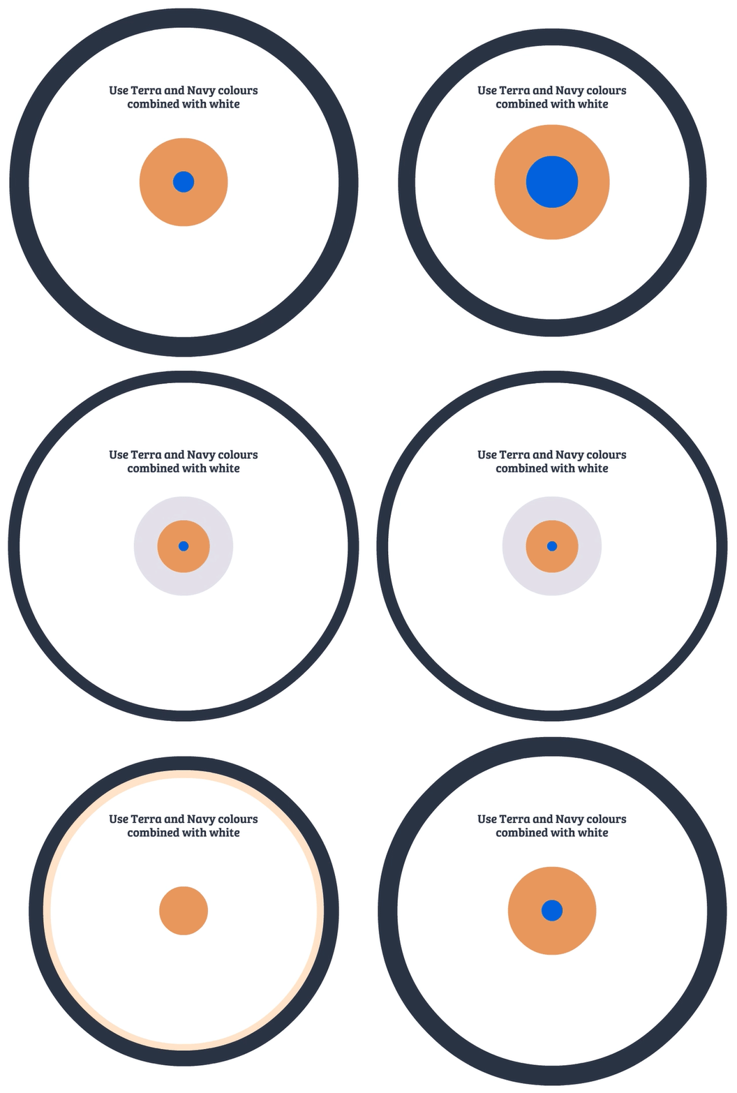
The ratio between our colours and the white background depends on the amount of information and the font size. White generally dominates our content.
In media including multiple types of layout – including online videos, brochures and dynamic banners – you can also use a background in terra or navy. We do this when we need more variety or when we want to create an attractive lead-in, i.e. introductions to Instagram videos, slides for presentations, spreads in brochures and dividers between online banners.
 onderneming