
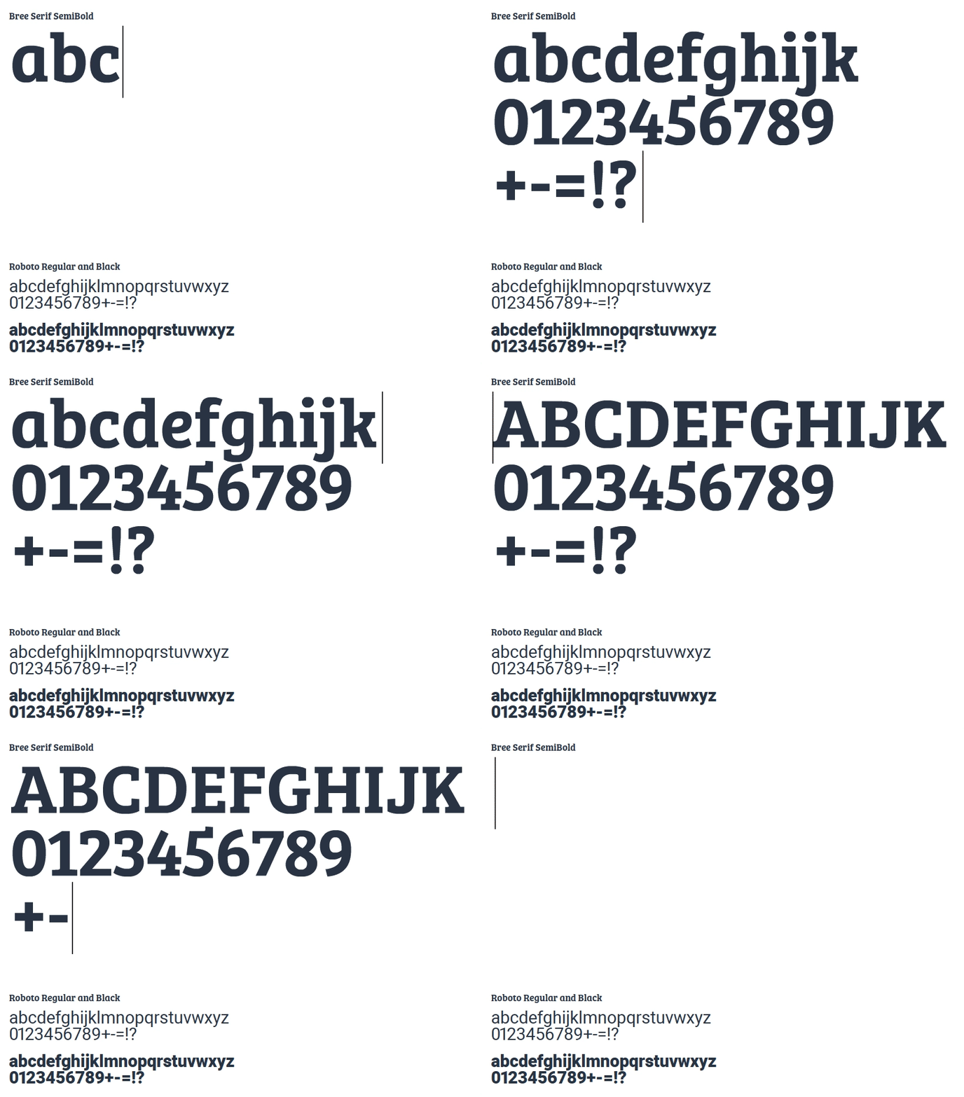
Bree Serif and Roboto are the two fonts used by Marktplaats. For headings and subheadings, we use the Bree Serif SemiBold font. The same font is also used in our logo, creating a clear brand identity.
For longer texts, we use the Roboto font. We can use two weights for this font: Regular and Bold. The Roboto font is only used for body text or supporting text such as captions.
This font is never used in larger point sizes. We do not use uppercase (capital letters) in texts, other than standard use of uppercase based on Dutch-language conventions.

Use of typography
Since copy and tone of voice are two of the defining features of our style, it’s important to use typographic elements very consistently, so as to create a distinctive look and feel for the brand.
Strong headings
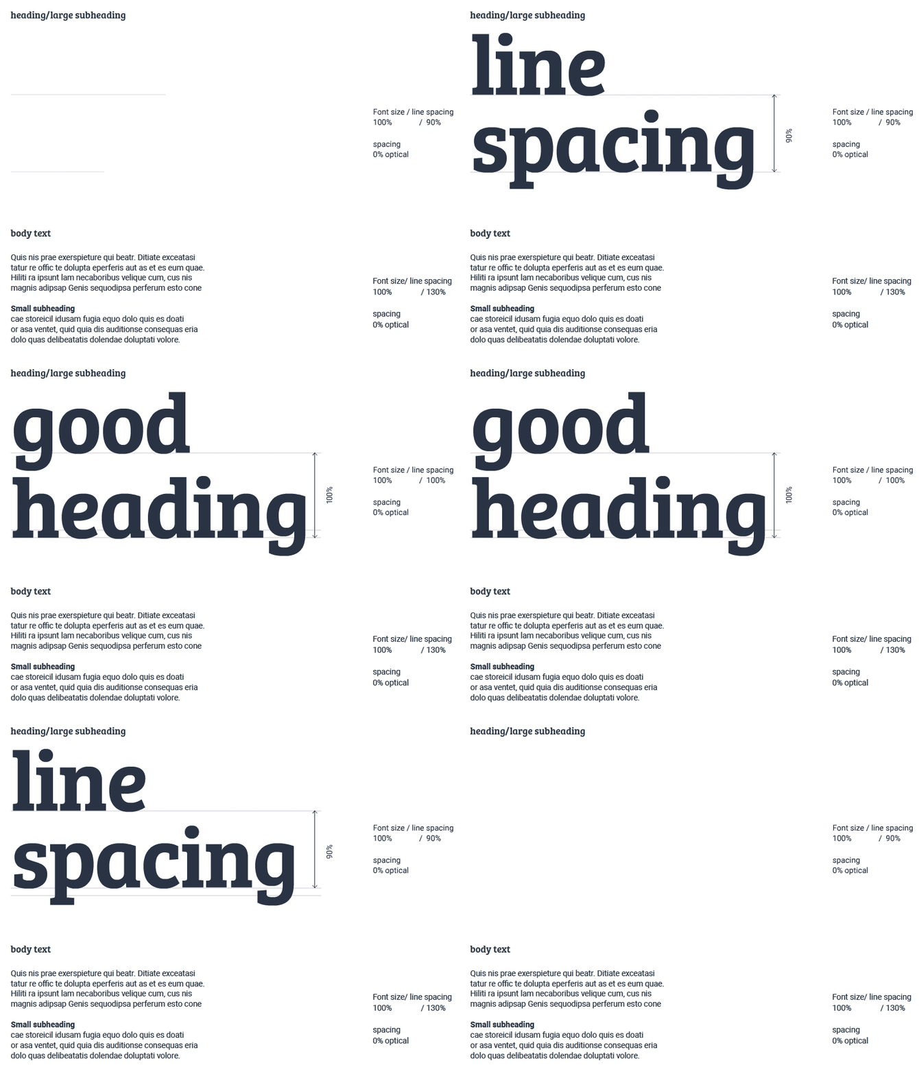
We use the Bree Serif font for headings ad subheadings, preferably large and with compact spacing. We also like to keep the overall line spacing very compact. This ensures that the message comes across loud and clear, combined with a strong and bold look and feel. This requires that we keep the
copy brief and concise.
Preferred line spacing is 90%. This is always the point of departure. If the leg and tail of two letters clash, you can adjust the line spacing to a maximum of 100%. The Bree Serif font is never used for longer texts, such as body text or headings.
Body text
We use the Roboto font for body text or supporting copy. You can choose from two weights: Regular and Bold. The Roboto font is never used for large type, but we always use a size that ensures the font is clearly legible. Minimum font size is 10pt; maximum size is 14pt.
 onderneming